A Model of Quality Control in Strong Link Science
Building on Mastroianni
Adam Mastroianni recently wrote a great post on strong-link vs weak-link problems. In short, performance on a strong-link problem is determined by the top results but weak-link problems are constrained by the worst results. It’s the difference between a javelin throw and a Survivor-style obstacle course. In a javelin competition, only the longest distance gets recorded, but in a Survivor game your team doesn’t win until your weakest member is across the line.
Adam makes a great case that scientific progress is a strong-link problem. We can ignore the lowest quality scientific output (like lil sperm boys), but the frontier of progress is pushed forward only by the highest quality discoveries. When we look back on the history of science it is clear that progress was made by raising the ceiling of scientific knowledge and not by raising the floor. Some people still believe in flat Earth today, but our knowledge of astrophysics has advanced massively.
I have been thinking about this idea a lot over the past few years and I think I can add a helpful model/visualization to the discussion. Adam uses this chart to explain the difference between strong and weak-link problems but there is a much more informative way to look at the difference.
From this birds eye view of the distribution of outcomes you couldn’t tell which one is strong-link and which is weak-link without the big red boxes. The Bad-Good axis on the chart represents the quality of the inputs to science: The lab work, theoretical model, or paper. Most projects have average quality inputs and land in the center of this axis. A few outliers have incredible insights and compelling communication and land on the far right side. But there is a hidden axis on this graph which is only represented by the red boxes: the impact of the science. Implicitly on this chart, moving from the average quality to highest quality inputs in a weak link model doesn’t change impact much; it doesn’t cross into a red box. But the change in impact from the average to the high quality inputs in strong link science is huge. The difference between strong/weak-link models of science is how changes in quality of input translate into changes in impact.
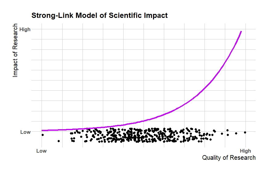
We can represent this difference on a two-axis graph. On the bottom we’ll keep the same axis that Adam charts above: low quality to high quality research. But I add an axis representing the final impact of that research so we can show the relationship between them. Here’s what strong-link science looks like in this model:
The dots from Adam’s frequency chart are arrayed along the bottom axis (I added some height for clarity but they are actually on a one dimensional line). Now we see why the right side of his chart was highlighted with the red box. The few projects that reach such a high quality dominate the overall impact of science. Moving from the left edge to the middle doesn’t increase final impact much. But moving from the middle to the right side produces huge gains in impact. This non-linear relationship between input quality and final impact is what makes science a strong-link problem. In the limit, like a javelin throw, only the very highest quality throw makes any difference to the final outcome.
There is lots of empirical support for this heavily right-tailed relationship between quality and impact in science.
Analyzing Peer Review With This Model
Adam has several great posts criticizing peer review and this idea of strong vs weak-link science is always in the background. This model makes the case against peer review clearer.
Peer review is trying to solve an information problem. It’s difficult to figure out where a given project falls in the distribution of input quality and especially in final impact. Funding and attention are scarce so we only want to fund and study projects with high final impact. There are many possible ways we could try and filter projects by impact. Peer review is intended to act as a minimum input quality requirement. Since input quality and eventual impact are related, a filter on input quality also filters projects by impact.
If you have a weak-link view of science, you’d think peer review works something like this. The relationship between quality and eventual impact is linear, or perhaps even bowed out a bit. Moving resources from low input quality projects to average ones is at least as important to eventual impact as moving resources from average projects to high quality ones. The quality of a given project is drawn from some random distribution, but peer review can change that distribution.
If peer review can perfectly cut out the bottom half of the quality distribution, as shown above, then researchers and science funders only spend resources on projects in the top half of the impact distribution. Even if peer review has some costs that cause fewer projects funded overall, it can lead to big gains in total impact and efficiency.
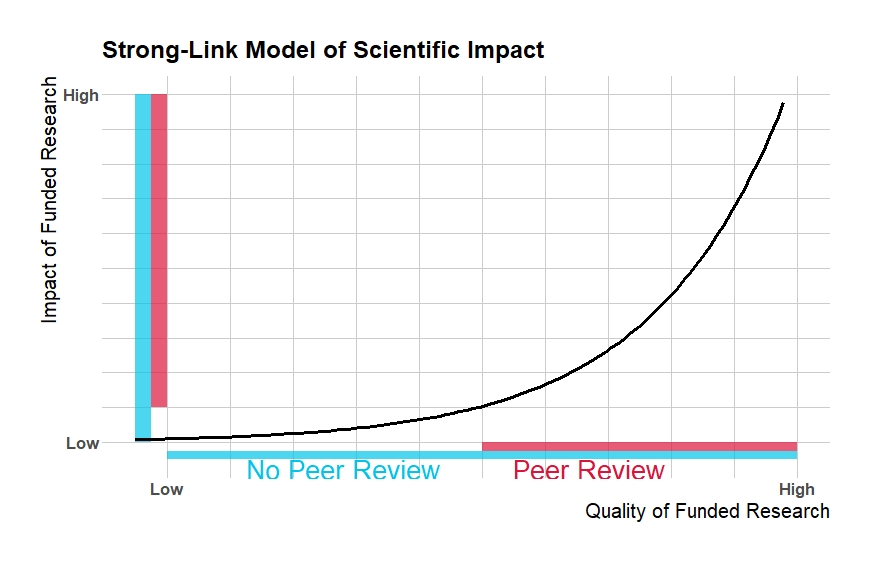
In a strong-link model of science, filtering the bottom half of the quality distribution is less important to final impact.
Even though peer review has the same perfect filter on the quality distribution, it doesn’t translate into large changes in the impact distribution. Lots of resources are still being given to projects with very low impact. Although the average input quality increases by the same amount as in the weak link model, the average final impact barely changes. Since peer review has significant costs, the slightly higher average impact might fail to make up for the losses in total output compared to no peer review.
This is a simplified model but many of the simplifying assumptions are favorable for peer review. For example, peer review here is modeled as a filter on the bottom end of the quality distribution. But as Adam points out in his post peer review is perhaps better modeled as a filter on risky projects. This often includes some of the highest impact scientific discoveries as evidenced by the testimonials of several Nobel prize winners who say they could not have done their prize winning world in today’s academy. If peer review also cuts out some projects on the top end, its increase of the average impact of scientific research would be muted or even reversed.
Conclusion
Science is a strong link problem because the relationship between input quality and final impact is non-linear. The top few percent of scientific projects by quality account for the majority of scientific progress/impact.
The relationship between quality and impact is important for peer review. Observing ex ante quality is much easier than predicting ex post impact. But since quality and impact have this non-linear relationship, peer review’s focus on filtering the bottom end of the quality distribution is unlikely to be productive.


Isn't it likely that the the bottom % of papers have negative impact? (e.g., Wakefield's MMR autism fraud paper). I think I agree with your overall point but steelmanning the argument for peer review would probably mean drawing an s-curve with the negative spiking left tail causing significant harm.
"Although the average input quality increases by the same amount as in the weak link model, the average final impact barely changes."
This isn't true - peer review which filters out the bottom half of research improves the average impact *more* in the increasing returns graph than in the linear graph. Try comparing the areas in the graphs.
Intuition: if every piece of research has nonnegative impact, then the best you can do by filtering out the bottom half of research is to double the average impact of research. That's what happens if the bottom half of research all has zero impact. And the closer the bottom half of research is to having zero impact, the closer you get to doubling. And increasing returns keeps the bottom half closer to zero, relative to the rest of the graph.
Some math which you can check by taking some integrals: If the lowest quality research has 0 value...
... and the graph is linear (y=kx), then removing the bottom half is a 1.5x multiplier on average value
... and the graph is quadratic (y=kx^2), then removing the bottom half is a 1.75x multiplier on the average value
... and the graphic is cubic (y=kx^3), then removing the bottom half is a 1.875 multiplier on the average value